


In this Q&A series, we turn the spotlight on one thought-provoking renovation each week. Here, Nicole Chapman, interior designer at Empire Interiors, shares the journey of turning a skinny, two-bedroom, one-bathroom terrace on a into a three-bedroom, 2.5-bathroom home with multiple living areas, including a bijou roof terrace – all with less than 100 square metres to play with.
Tessellated tiles: Citi Tiles
Redoing your terrace home? Find a local architect on Houzz to help make it happen

What was the original house like?
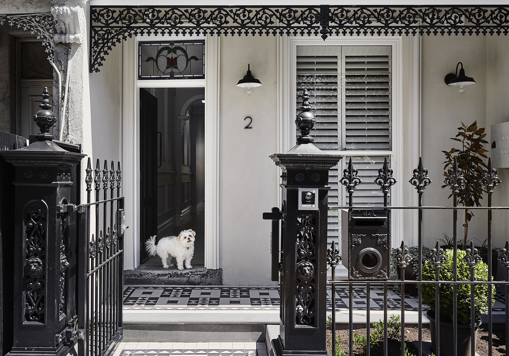
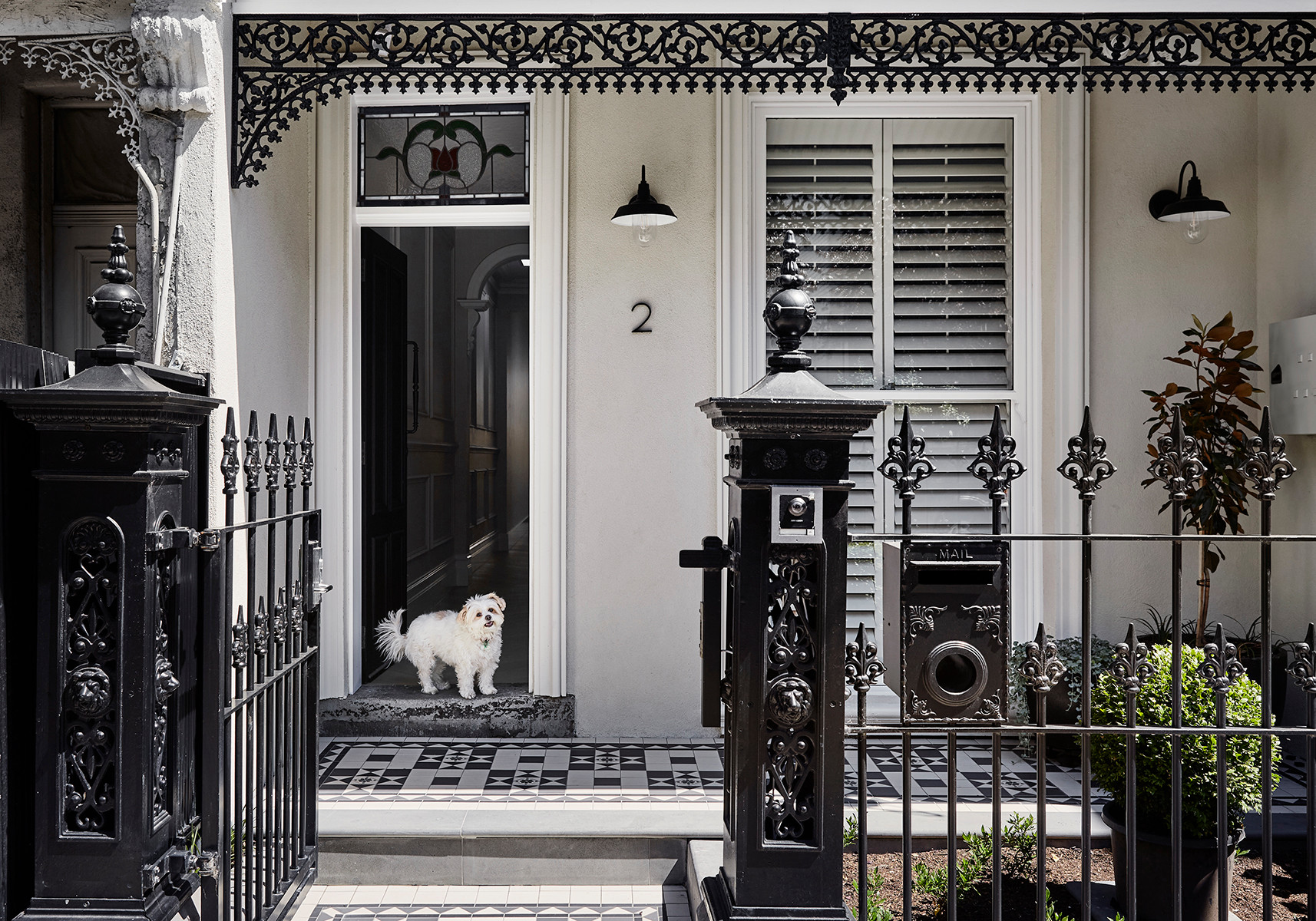
A two-storey, single-fronted Victorian terrace that is 4.2 metres wide, built in the early 1900s.What state was it in?
Dark and unrenovated.
A two-storey, single-fronted Victorian terrace that is 4.2 metres wide, built in the early 1900s.What state was it in?
Dark and unrenovated.
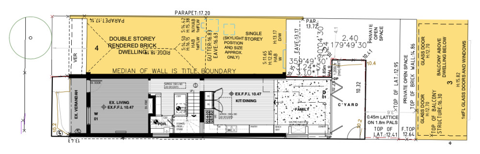
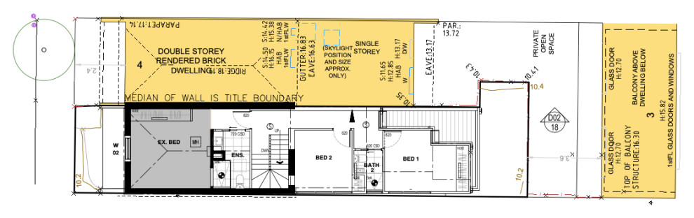
Ground-floor plan
How would you describe this project?
A renovation/restoration and rear addition.
What wasn’t working for the client about the house originally?
- Not enough space for a family of four.
- No storage.
- The interior was dark.
- No room for entertaining.
- Not enough separation between spaces.
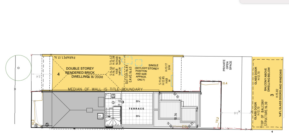
First-floor plan
Brief
- Extend and add more useable open-plan living space.
- Add an extra bedroom.
- Add an extra bathroom.
- Maximise the site as much as possible, which meant adding an outdoor rooftop space to compensate for the small ground-floor courtyard.
- Create a light, bright and serene space.
- Add plenty of storage.
Rooftop-terrace plan
What were their must-haves?
- Three bedrooms.
- At least two bathrooms.
- Laundry on the ground floor.
- A rooftop deck/terrace.

Gained
- A third bedroom.
- A third bathroom.
- A rooftop deck/terrace and bar.
- A second living space.
- A fireplace.
- Indoor/outdoor living with the courtyard.
The kitchen before works
What exactly did you do?
- Retained the existing living room on the ground floor and bedroom above it, and gutted the rest of the house.
- Removed the original rear addition.
- Reorientated the staircase to maximise floor space.
- Put in a new addition to the rear of the property, housing an open-plan kitchen/living/dining space.
- Added a new central services area with a laundry, powder room and storage.
- Added a new ensuite to the master bedroom.
- Added two new bedrooms and a shared bathroom.
- Put in a rooftop terrace over the top of the new addition, which features a bar area.
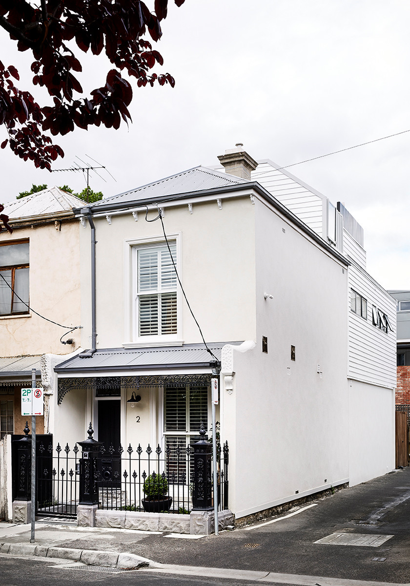
- Refreshed the exterior, with new paint, new windows and a new roof.
The kitchen before works
What was the budget?
$500,000.
Where did most of it go?
On the build costs itself as it was practically a full gut. A significant portion of the budget also went on the interior finishes.
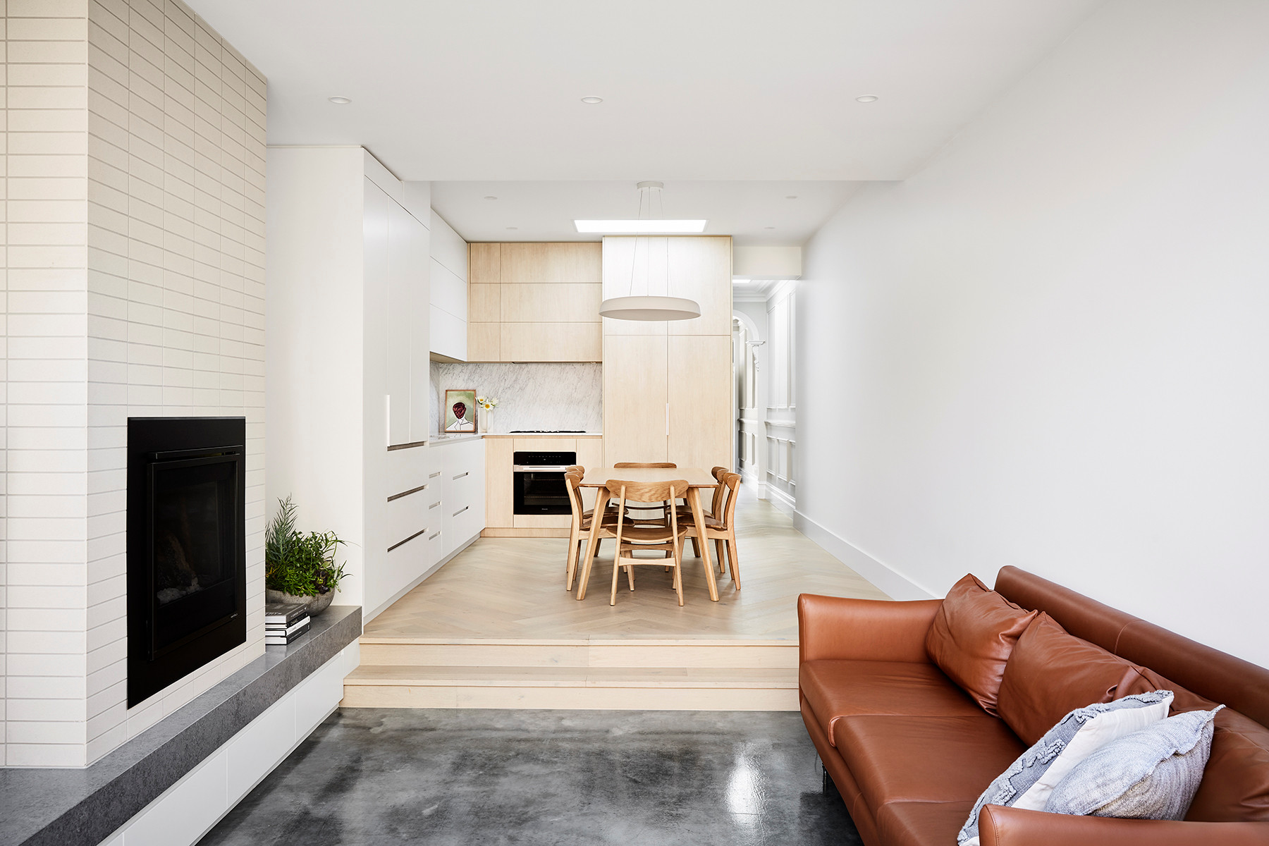
Why did you add a step-down between the living and dining area?
Because of the fall of the block. But it works really well to create a sense of separation between the kitchen and living areas.
Because of the fall of the block. But it works really well to create a sense of separation between the kitchen and living areas.
What was your thinking behind the colour and materials palette?
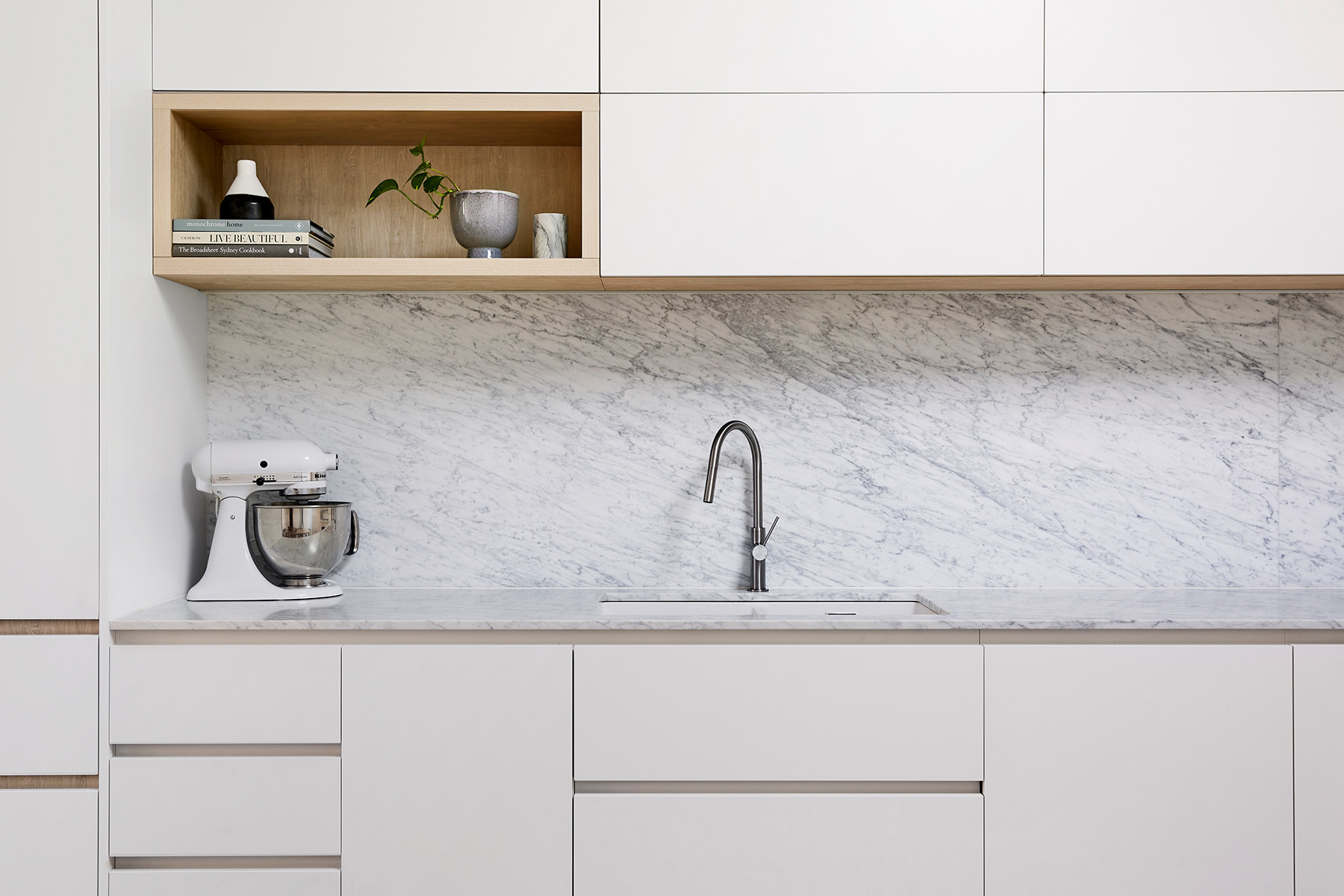
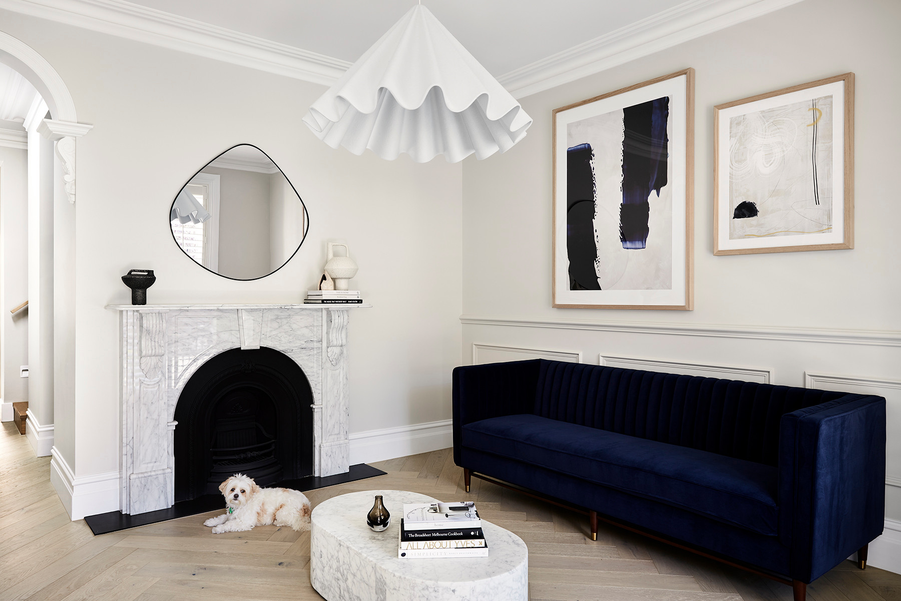
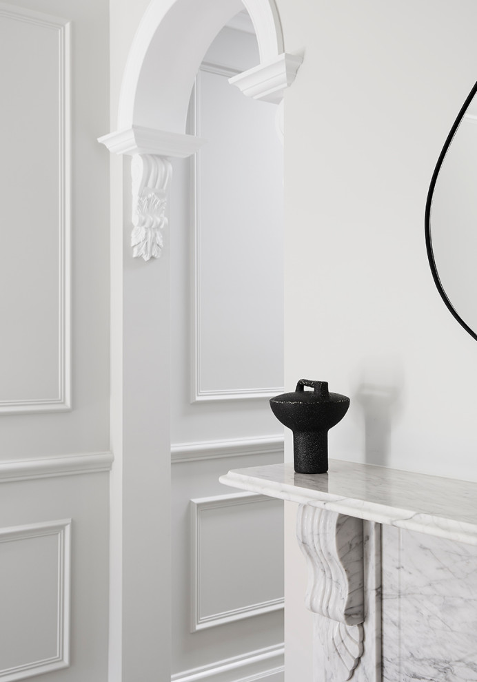
The materials used are authentic, subtle and timeless, combining natural honed Carrara marble, handmade Japanese tiles and oak veneers.The Victorian features of the original home have been honoured, while the new build components blend seamlessly with the old.
The materials used are authentic, subtle and timeless, combining natural honed Carrara marble, handmade Japanese tiles and oak veneers.The Victorian features of the original home have been honoured, while the new build components blend seamlessly with the old.
How does the new work address the problems outlined above?
This previously poky and dark property has been thoughtfully transformed into an open, light and serene family oasis designed with simplicity at its core.In the quest for a simpler life, the client made the bold decision to move their entire family from a large home in the outer suburbs into the heart of Richmond. This meant a dramatic downsizing of space but a significant upsizing in lifestyle.
This previously poky and dark property has been thoughtfully transformed into an open, light and serene family oasis designed with simplicity at its core.In the quest for a simpler life, the client made the bold decision to move their entire family from a large home in the outer suburbs into the heart of Richmond. This meant a dramatic downsizing of space but a significant upsizing in lifestyle.
How does the new addition complement or contrast with the original home?
The exterior is a simple pitched-roof form that references the home’s traditional archetype, with simple white weatherboard cladding to fit with its surrounding context.
The exterior is a simple pitched-roof form that references the home’s traditional archetype, with simple white weatherboard cladding to fit with its surrounding context.
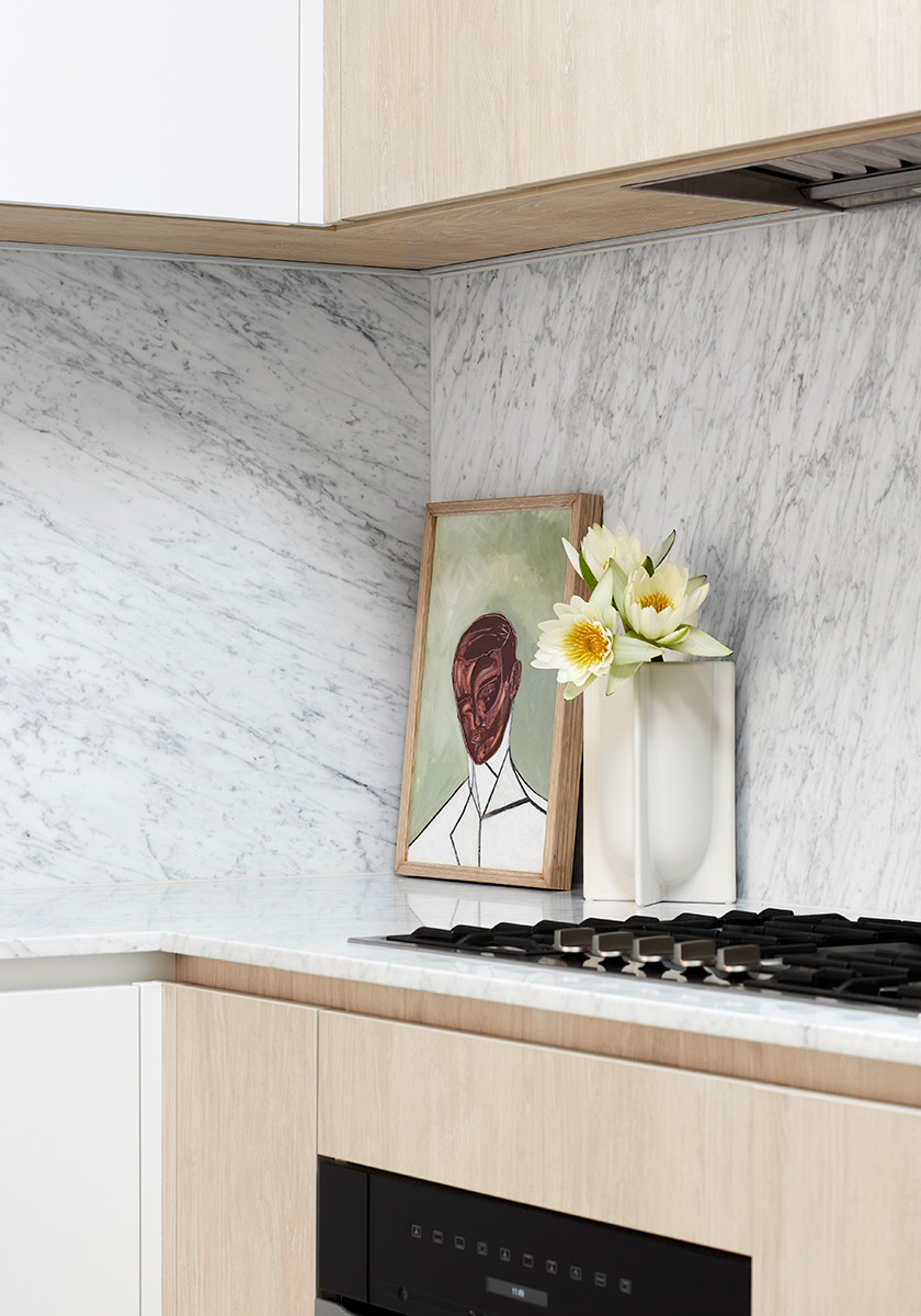
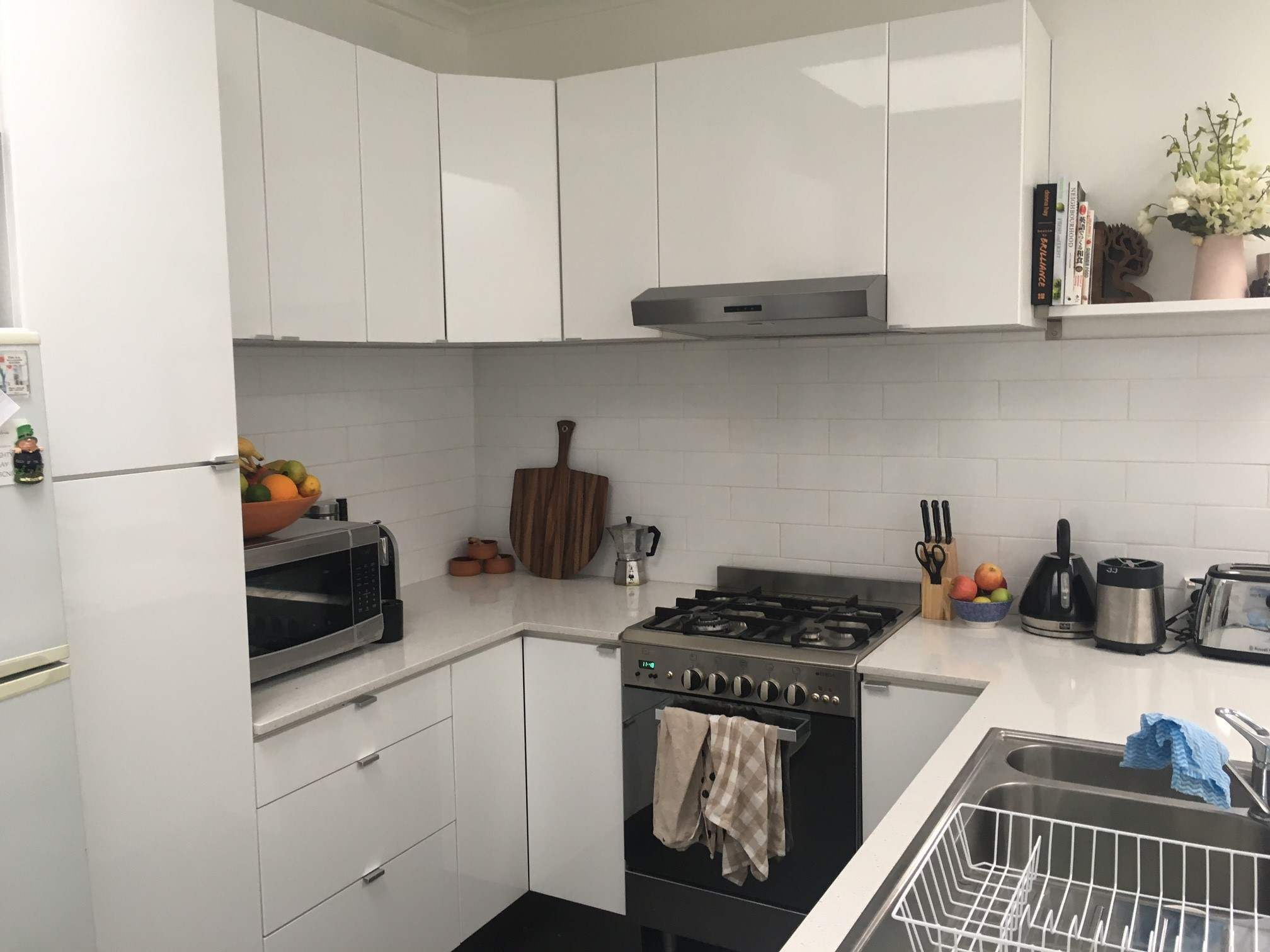
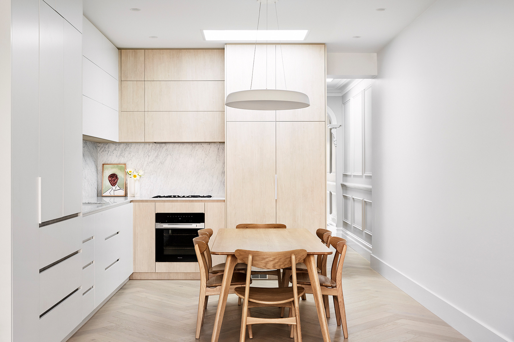
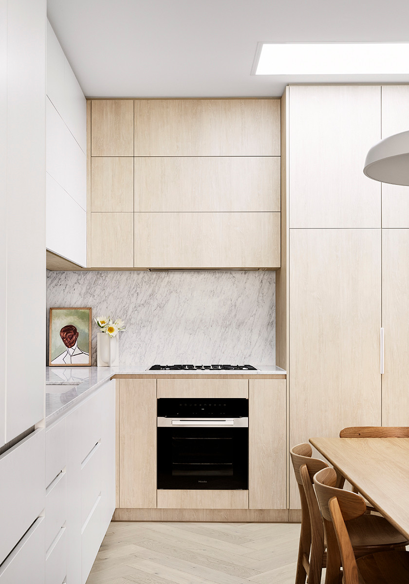
What look and feel were you trying to create in the kitchen? Form and function were equally important goals for this client. We wanted to ensure it looked and felt calm and streamlined, while integrating smart storage such as a mini hidden butler’s pantry, a pull-out pantry and integrated appliances.
We also used authentic and timeless materials to pull the design together.
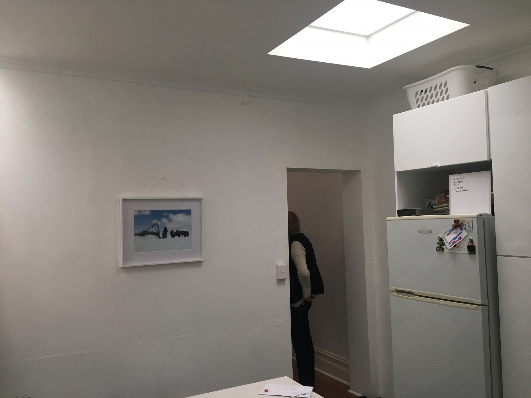
An LED-type skylight was added to bring in more natural light.
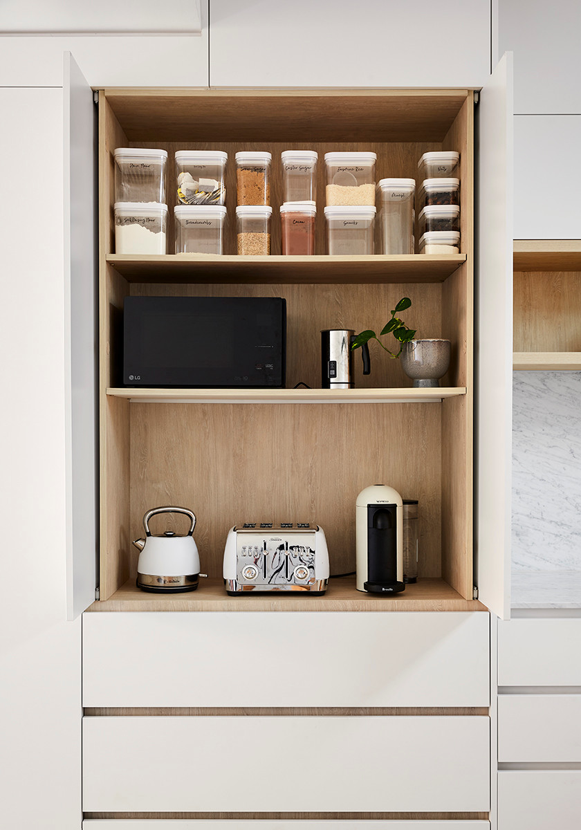
An appliances niche provides handy storage for essentials, while keeping the kitchen streamlined
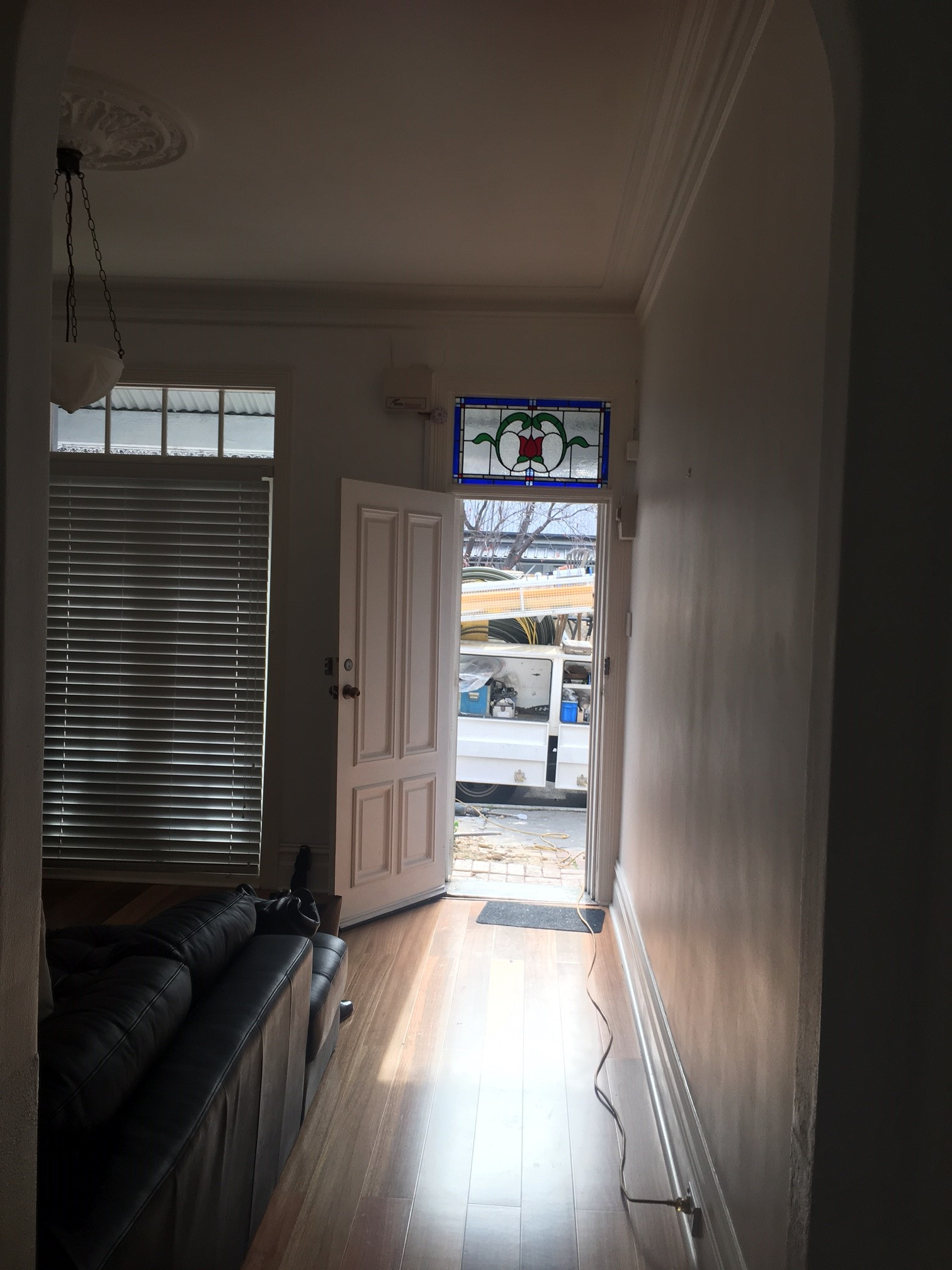
The original front entrance
What are the defining features of this house now?
- The minimalist kitchen that packs a serious storage punch behind every door, including a mini butler’s pantry and intergrated appliances.
- Uninterrupted views across Melbourne’s iconic skyline from the roof.
- The custom oak and steel spiral staircase that connects the three floors.
- The full-size master ensuite with walk in-shower, generous vanity and natural light.
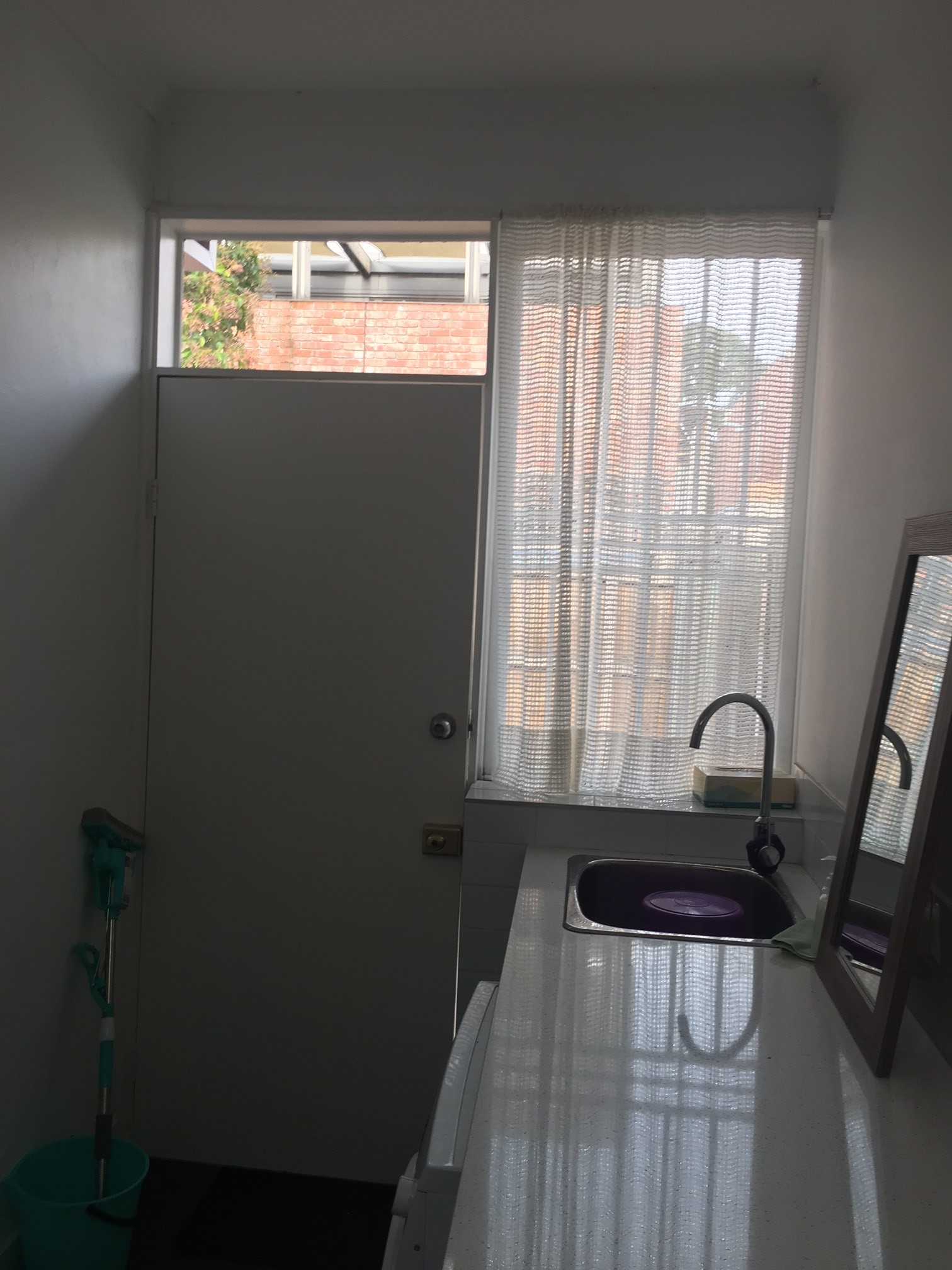
The original laundry
Why do you think the house works so well now?
There is no wasted or unused space in this home.All four family members have been factored in from a space and storage perspective.
The home also allows for entertaining, with a large central dining table and fireplace in the main kitchen/living spaces, allowing the home to be practical for everyday living as well as hosting special occasions with friends and family.
Tell us about the beautiful wall mouldings
All the wall panelling is new. We took inspiration from the Victorian-era homes in the area.
All the wall panelling is new. We took inspiration from the Victorian-era homes in the area.
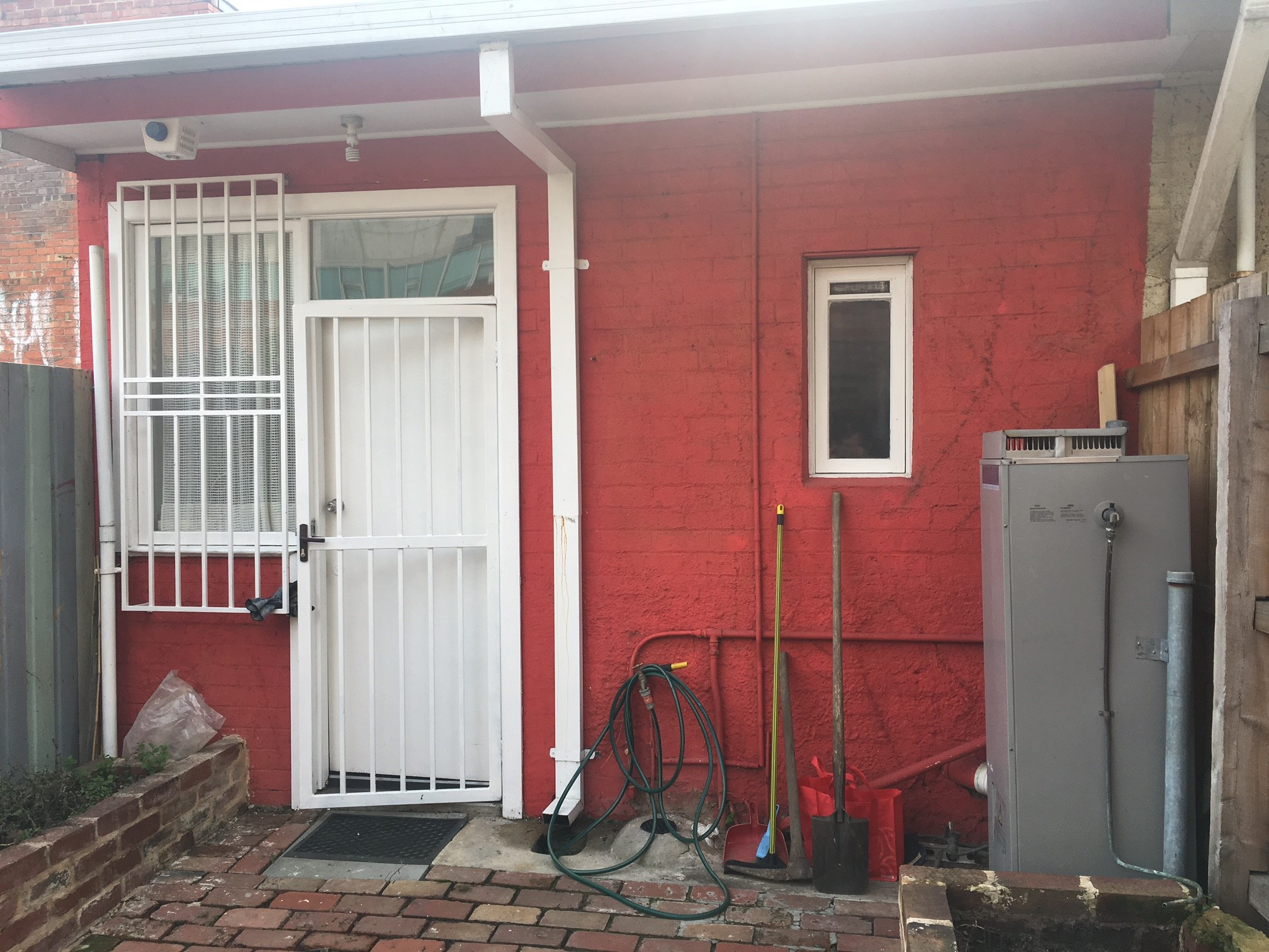
The original rear exterior
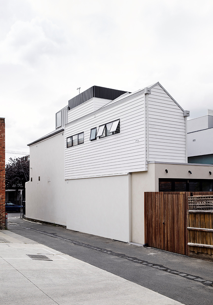
The rear facade after works
What challenges did you have to work around during this project?
With a lot size of less than 100 square metres, the brief for a three-bed, 2.5-bath family home meant maximising every centimetre of useable space within the floor plan.
With a lot size of less than 100 square metres, the brief for a three-bed, 2.5-bath family home meant maximising every centimetre of useable space within the floor plan.
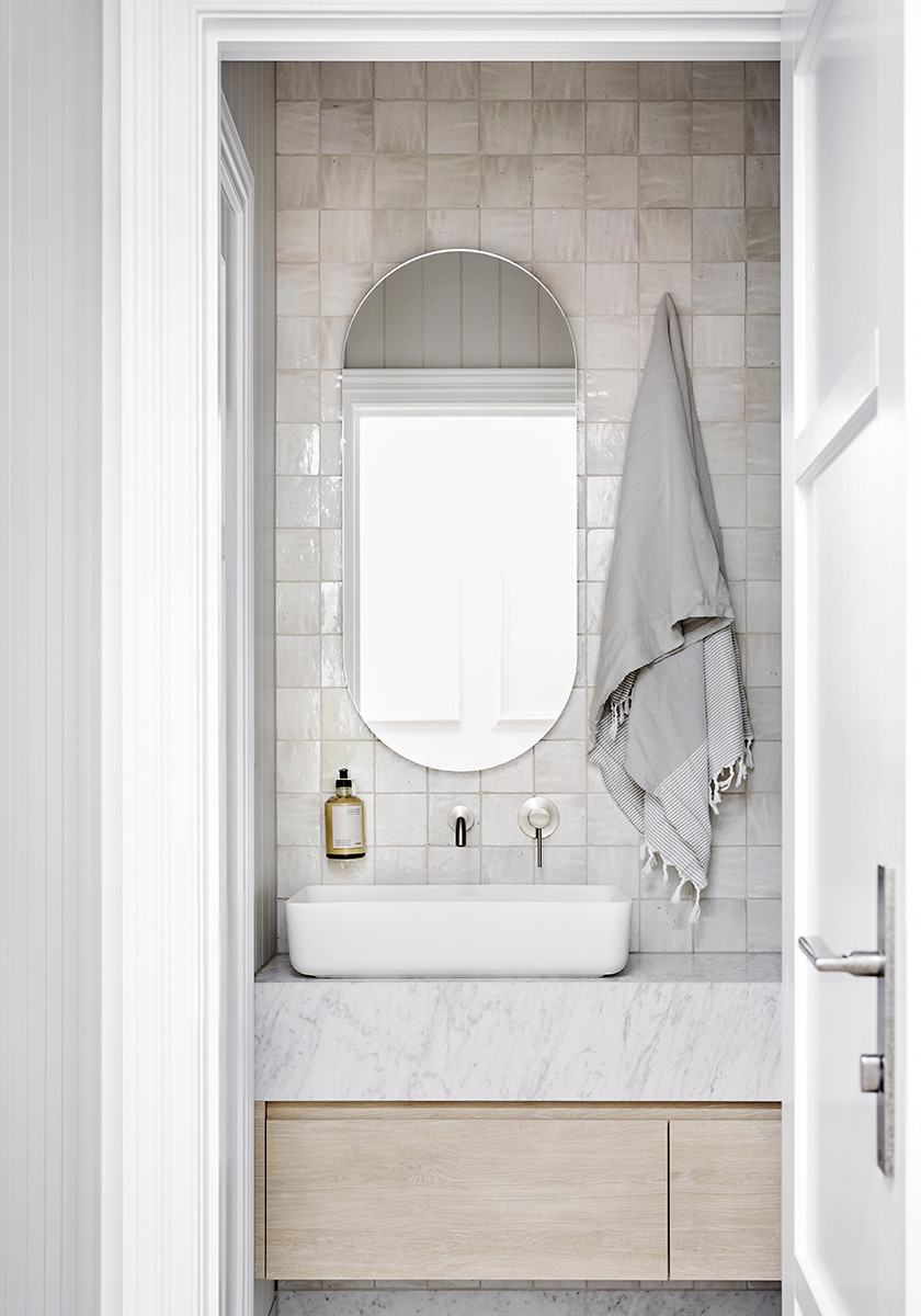
Tell us about this bathroom
This is the ground-floor powder room, which is designed to service both the family and visiting guests.The handmade Moroccan tiles combined with Cararra marble evoke a sense of luxury and calm.This space has been thoughtfully tucked away in the previously unused under-stair area.
This is the ground-floor powder room, which is designed to service both the family and visiting guests.The handmade Moroccan tiles combined with Cararra marble evoke a sense of luxury and calm.This space has been thoughtfully tucked away in the previously unused under-stair area.
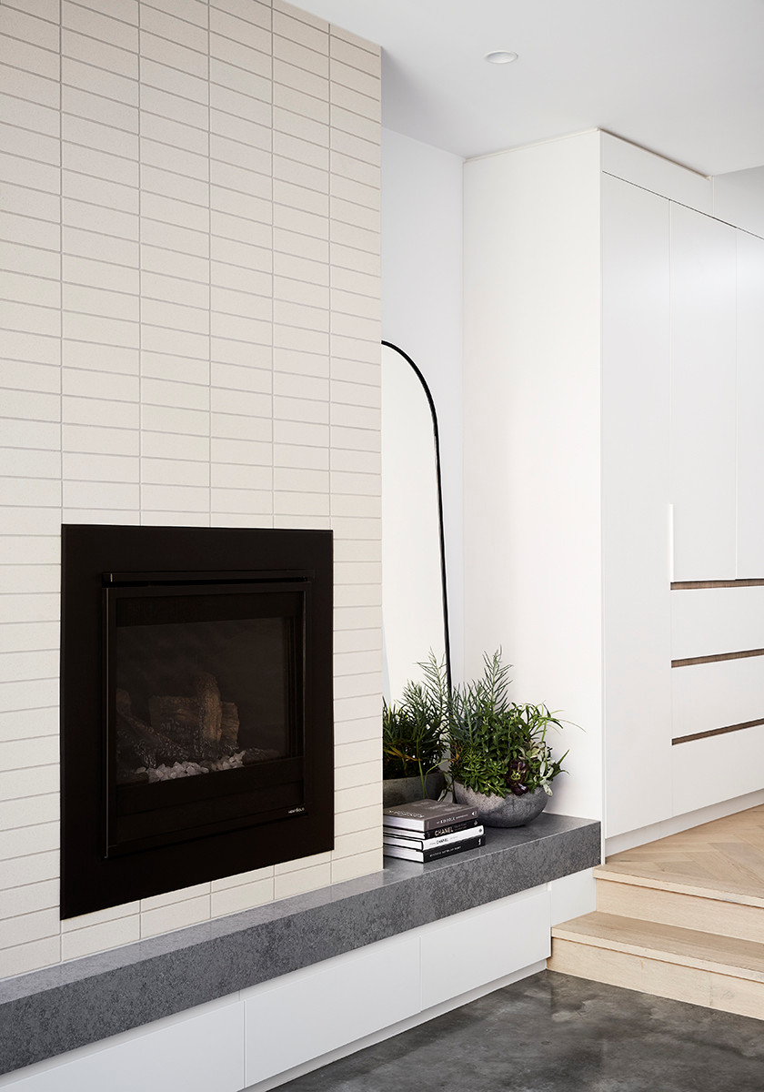
A new fireplace from Schots Home Emporium adds warmth and atmosphere to the living area
A full rooftop bar, with its own fridge and dishwasher, was added above the new addition. It connects to the new rooftop courtyard
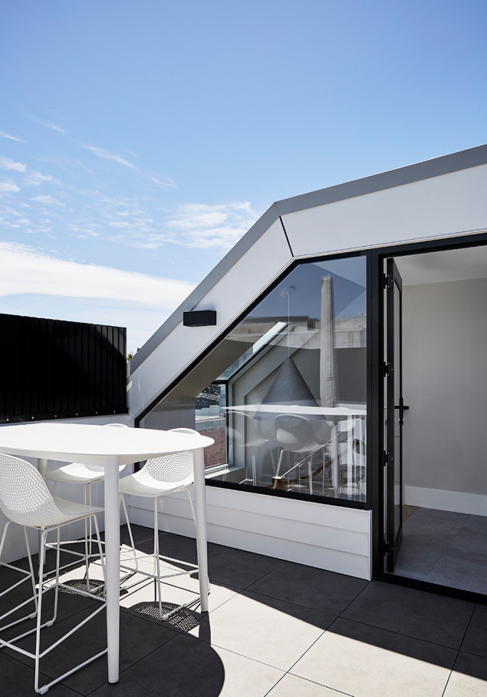
The rooftop terrace has some of the best views across the MCG (Melbourne Cricket Ground) and the city skyline.
This space is used by the owners for quiet moments at home and also when they entertain.
Key design aspects
Interior materials palette
- Eastern Flooring Centre timber flooring.
- Tiles from Tile Citi, Artedomus and Perini Tiles.
- Stone benchtops from CDK Stone.
Paint palette
- Dulux Lexicon Quarter and Porter’s Paints Haloumi used throughout.
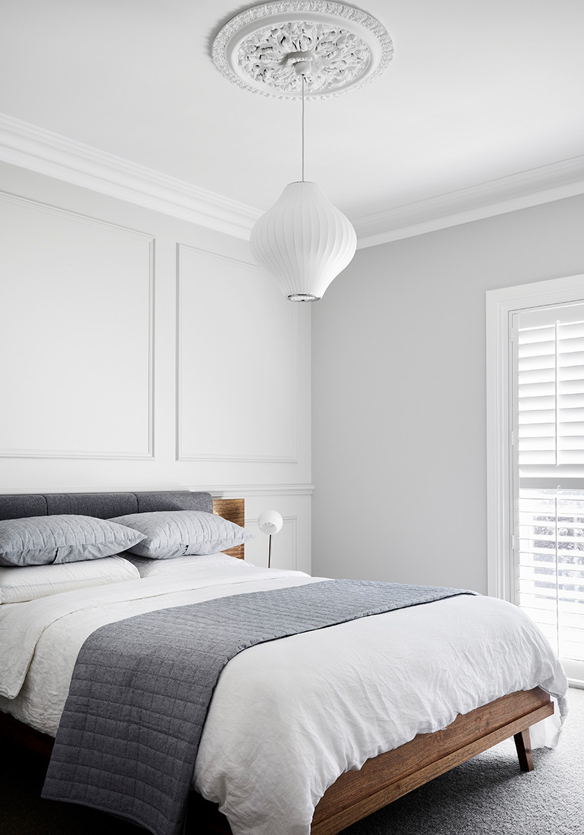
The new ensuite
Fixtures and fittings
- Built-in mirrored cabinets to the shared bathroom and powder room from ADP.
- Kitchen pendant from Beacon Lighting.
- Schots Home Emporium fireplace.
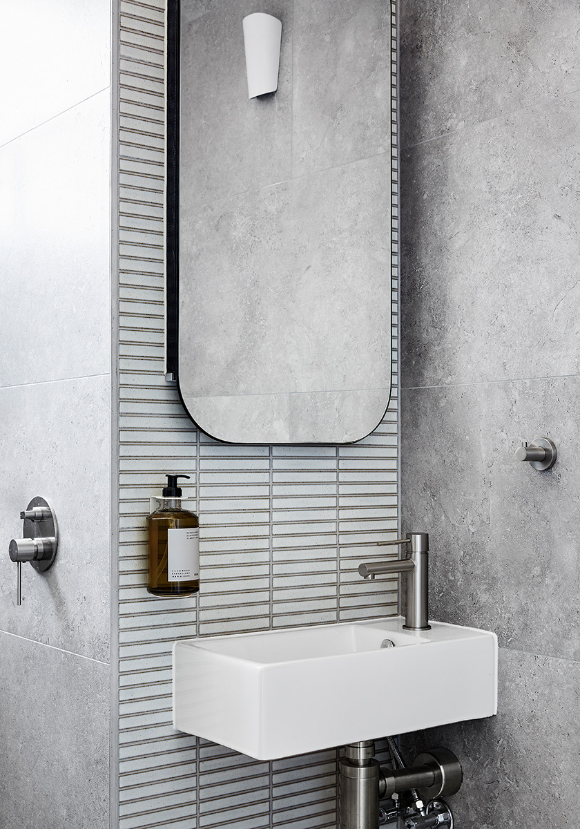
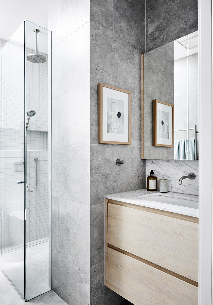
The new shared bathroom
Tell us about the shared grown-up kids’ bathroom
We used handmade Japanese finger tiles in the adult kids’ bathroom to bring in some architectural elements and add texture and interest to the space.
Answers by Nicole Chapman, interior designer at Empire InteriorsWho lives here: A couple and their two grown-up children
Location: Richmond, Victoria
Bedrooms and bathrooms before works: Two bedrooms, one bathroom
Bedrooms and bathrooms after works: Three bedrooms, 2.5 bathrooms
Living areas before works: One
Living areas after works: Two plus a rooftop terrace
Original size of the house: Approximately 95 square metres
Size after works: Approximately 162 square metres
Interior designer: Nicole Chapman at Empire Interiors
Building designer: Sketch Building Design
Builder: Melbourne Home Builders